Category: Uncategorized
-

Instagram’s New 5-Hashtag Limit: Why It Happened and How to Adapt
Instagram is shaking up how we use hashtags. In its latest update, Meta (Instagram’s parent company) announced that you can now include only up to 5 hashtags per post, a big change from the 30-tag free-for-all many of us knew. If you’re a small business owner used to piling on hashtags to get noticed, this…
-
Setting Social Media Objectives in 2025
Social media is one of the most powerful tools for growing a business, and setting social media objectives is essential to achieving success. Without clear goals, it’s easy to feel lost and unsure of whether your efforts are making an impact. By defining actionable objectives, you can turn your social media strategy into measurable results…
-
Is Posting the Same Content on Facebook and Instagram Effective in 2024?
In today’s social media landscape, businesses often wonder if they should be posting the same content on Facebook and Instagram. In 2024, the answer is more about strategic adaptation than creating completely separate content streams. Since Meta’s acquisition of Instagram, the platforms have become more integrated, allowing for a streamlined approach to content while still…
-

Building Your Brand: How Marketing Can Help.
A strong brand identity helps businesses differentiate themselves from competitors and establish a unique identity that resonates with customers. Marketing plays a crucial role in building and maintaining a strong brand identity. By promoting the brand values and messaging through various channels, marketing helps businesses establish brand awareness and recognition. In this blog post, we’ll…
-

What’s the Difference Between a Brand and Branding?
By Kim Dickerson Ghostwritten by Wendy Scheuring Last year, we wrote a blog on branding and its importance to your business. Today’s blog offers a reboot on branding. Your logo is vital to your branding. So is your company name. So is your mission and your vision which we discussed in our latest blog. Throughout…
-
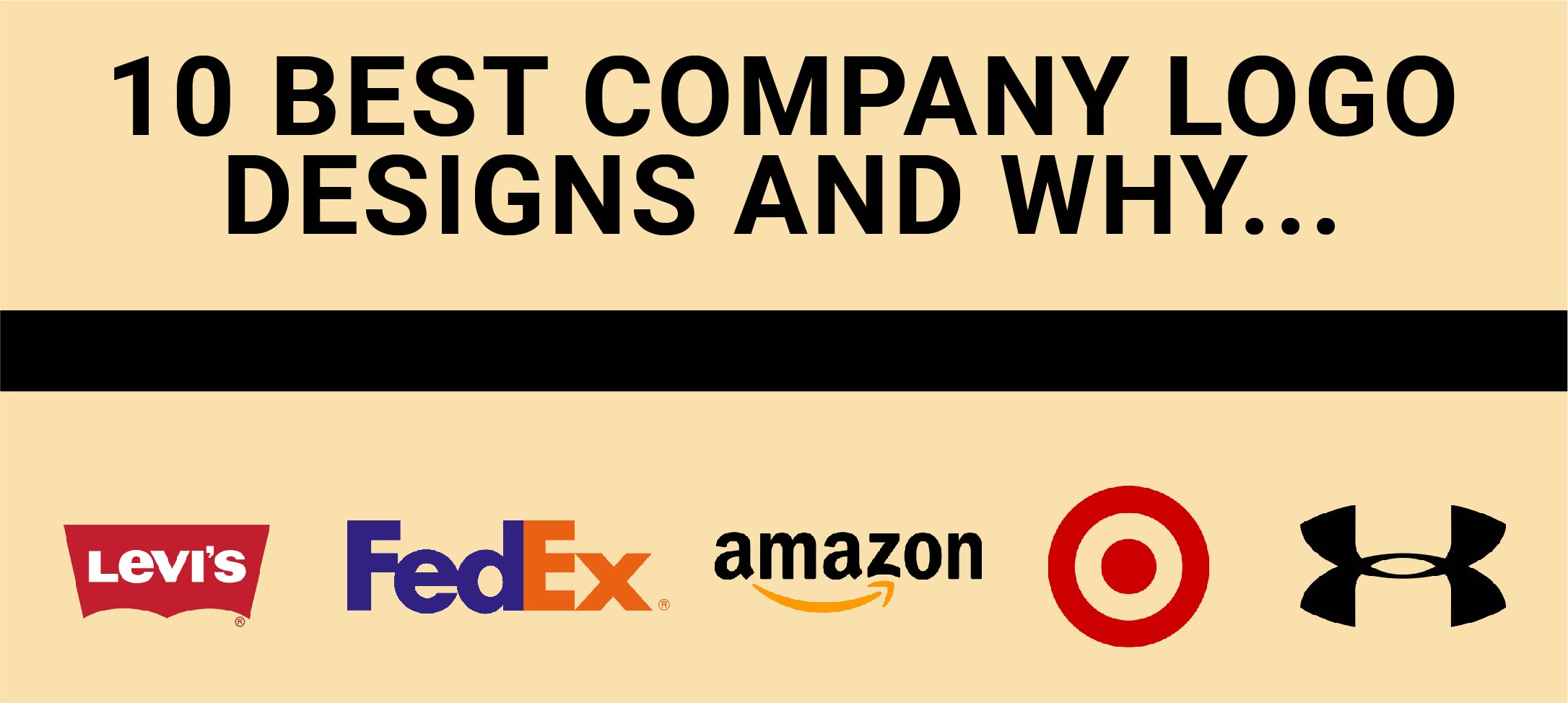
10 Best Company Logo Designs and Why
There are some company logo designs that you can’t help but think of when you think about what a good logo should look like. Weather it be their creative simplicity or complex cleverness, some logos will stand out in your mind forever. If you are needing a logo for your company or are wanting a…
-

A Guide to Business Cards Basics
When you hand someone a business card, you are handing them a piece of your company. Business cards should no doubt make a good impression. In a lot of cases, your business card forms someone’s initial views on your company. Data collected from a survey done by Statistic Brain Research Institute, showed that 72 percent of…
-
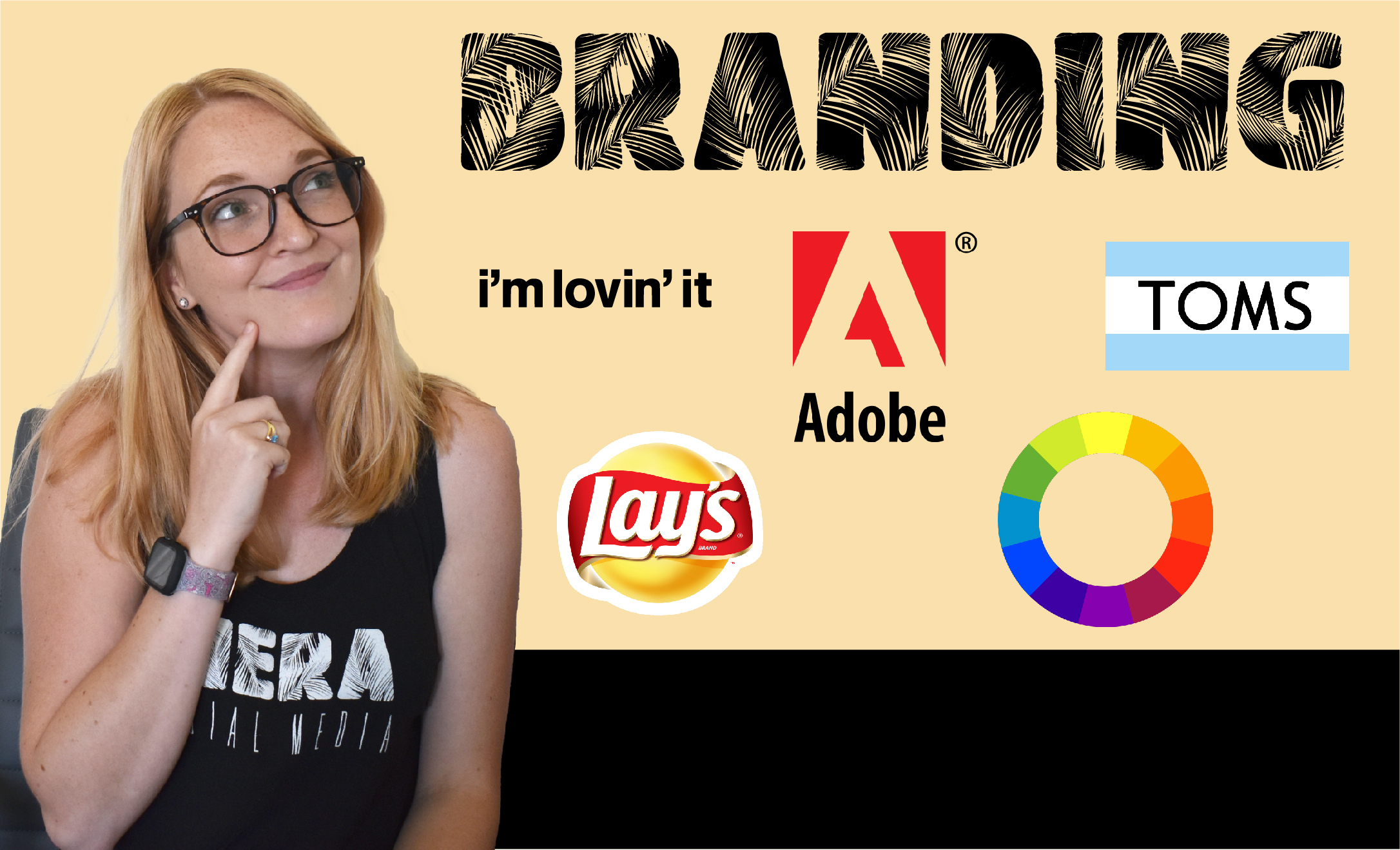
Why Your Business’ Branding is so Important.
What is the first thing you think of when you hear the word, “brand?” Maybe a certain brand came to mind, one of your favorites, like Nike or Panera Bread. What about when you hear the word, “branding?” You probably think of things like, a logo, or company colors, maybe even a tagline or slogan.…
-

Everything a business in Brevard County needs to know to Optimize their Instagram Bio section.
Everything a business in Brevard County needs to know to optimize their Instagram Page.
-

Choosing the Right Instagram Profile Picture for your Business’s Instagram Page
Make sure to consider these helpful tips before choosing your profile picture for your Instagram business page!